Visually Analysing Direct Set Pieces in Football
Share
A review of working with Football data to analyse Free Kicks & Penalties.
21st May 2008. Moscow. Rain is pouring in the Luzhniki Stadium as John Terry steps up to take the penalty that will win the Champions League for the first time in Chelsea’s history.
POST!
That fateful night in Moscow is best remembered for the rain/tear-streaked face of the Chelsea captain as Manchester United players wheel away in delight after winning the coveted European trophy. Less well remembered was the close friend and advisor of Chelsea manager Avram Grant: Spanish Professor Ignacio Palacios Huerta.
Huerta, dubbed ‘the penalty doctor’ for his work on linking economic game theory to penalty kicks, provided some invaluable information to the Chelsea manager before the game. Firstly, he had observed that United Goalkeeper Edwin Van der Sar had historically displayed a strong tendency to dive to his right. Secondly, Cristiano Ronaldo tends to shoot to the goalkeepers right when he stutters in his run up. Before Terry missed his decisive penalty, 4 Chelsea players successfully scored to Van der Sar’s left. When Ronaldo stuttered during his run up, Chelsea keeper Petr Cech remained stationary, before diving to his right and saving the Portugese striker’s effort.
This passage of play captures the essence of using data in football. Data can be used to spot trends and inform players to act in a way that gives a team a competitive advantage over their opposition. Data cannot account for John Terry slipping on a rainy night in Moscow and firing his penalty against the post. Football is a game of fine margins: two inches further left and Huerta’s advice would have been critical in Chelsea celebrating the greatest night in their history. Sometimes your luck is out. When it rains, it pours…
Setting the Scene
This blog provides an introduction to working with & analysing football data. It focuses on using StatsBomb event & match data to analyse and present direct set pieces. The key question being asked is whether a reader can visually detect patterns in set piece efforts, with a view to providing goalkeepers and defenders information on how to set up when facing certain players.
A set piece is defined as a carefully organised and practised move in a team game by which the ball is returned to play, as at a corner or a free kick. Set pieces are a vital part of modern football; figures on the percentage of total goals scored from set pieces range from 53% in the 2018 FIFA World Cup to 25–33% across the course of a season according to this piece from StatsBomb’s Ted Knutson. Incidentally, in the Women’s Super League data we’ll be exploring later, the figure is 46.13% for the 2018/19 season and 45.16% for the first half of the 2019/20 season.
Even at the lower end of these figures, an astonishing 1 in 4 goals scored are attributable to set pieces. What’s more, analysis including a piece by the Telegraph suggests that their importance in Premier League football is on an upward trajectory (not quite Beckham vs Turkey at Euro 2004, but gradually upward).
On a similar trajectory is the number of Football Clubs using data as part of their match-day, tactical and long term strategy. Gradually, more and more teams are turning towards data analytics to gain an advantage over the competition. This may be through using data to target specific types of player for further scouting, understand ticketing patterns to maximize match-day revenue or by analysing performance data to drive new tactics, training scenarios, or set piece routines (think Southgate’s corner ‘love train’ routine at Russia 2018).
This blog makes use of StatsBomb’s publicly available datasets. These datasets are a fantastic resource for hobbyists and football stats fans to explore a huge amount of real data on match events. The data was first investigated during the summer, when StatsBomb released the first 12 seasons of Lionel Messi’s La Liga match data. If you’ve not worked with this kind of data before, it can be quite overwhelming in terms of the sheer number of metrics and granularity of the events collected. It grants a huge amount of opportunity, at the risk of not knowing where to start...
For that reason it is all the more important to start your analysis with a question to answer or a hypothesis to test. This provides immediate direction to your analysis, though it is also likely that on the journey to answering the initial question you will uncover answers to questions that you hadn’t thought of before you set off — think Donald Rumsfeld’s ‘unknown unknowns’.
In this analysis, I started with a fairly open question: ‘Can you visually detect patterns in Player’s set piece efforts on goal?’ Rephrased as a hypothesis, this could be written as: If we visualise set piece shot data, then we can detect patterns and advise Goalkeepers where players are likely to aim their shots from certain positions.
Working with Football Data
At the time of writing, there were 2 of StatsBomb’s datasets that caught my attention: Lionel Messi’s Data Biography (each of Messi’s La Liga matches for Barcelona) and the Women’s Super League (WSL) match data for 2018/19 and the first half of 2019/20.
The easiest way to access the public StatsBomb data is by using their R package, which has some handy functions to allow users to work with the data in a relatively clean format. R is a statistical programming language which is best used in tandem with R Studio; a clean graphical user interface which makes using R user friendly. I won’t repeat the functions for getting the data here, but Euan Dewar has written an excellent introduction in this document.
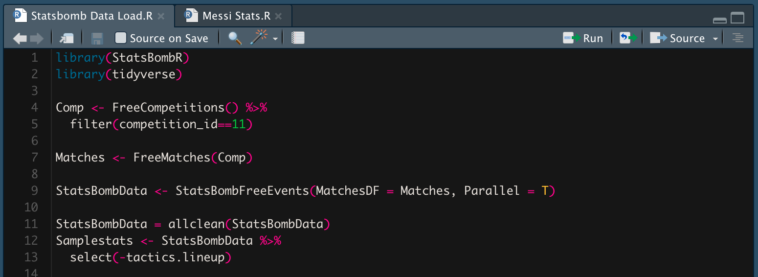
When analysing the first tranche of Messi data in the summer, I stuck to using the popular ‘tidyverse’ packages to analyse the data within R in order to create the positional heat map below. The upside to this method was that R’s preferred graphing package ‘ggplot2’ allowed me to analyse the data and customise the look and feel of the plot down to every single detail. The downside was that this took a fair amount of time to script and I was so focused on creating the single visualisation that I lacked the flexibility to explore other stories that may have emerged from the data.
I therefore decided to move outside of R on this occasion. Once I had filtered the data in R to the appropriate parameters and flattened out a few nested lists, I exported the data from R in csv format, two files (Event data & Match data) for the Messi data and two for the WSL data. The Messi data was 1.2GB in size, WSL was 394MB. I would not advise attempting to open either of these files in Excel. To effectively work with data of this size, without the frustrations of extremely long processing times, very hot and noisy laptops and predictably unpredictable crashes, you need to look outside of the familiarity of pivot tables and Excel charts.
Most traditional purpose built Business Intelligence/Analytics tools will allow you to work with this size of data without major performance losses. Having worked with three of these (Tibco Spotfire, Microsoft Power BI & Tableau) as part of my job for a number of years, my first port of call for exploring and visualising data is Tableau. In terms of visual analytics, the process of using pre-attentive attributes such as colour, size & shape to visually perceive patterns in data, Tableau’s drag and drop ethos and interface allows it to stand out above the competition when it comes to analysing and understanding data. To explore Tableau for yourself, go to Tableau Public and download a free version to start playing around with the data.
Before loading the .csv files into Tableau Desktop (where the analysis and visualisation happens), I made use of Prep, Tableau’s visual Extract Transform & Load (ETL) tool, in order to clean a few of the columns from the StatsBomb data. This stage also allows us to take a first look at the ‘shape’ of the data — an understanding of the type of data in each column (string/numerical/date) and the distribution of values into groups or buckets within a histogram.
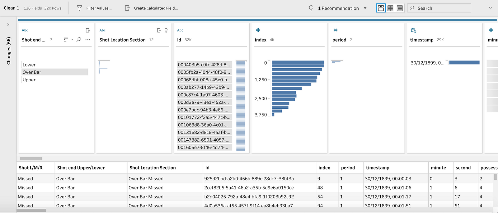
While Prep is becoming increasingly advanced in its functionality, I mainly used it in this case for renaming columns (eg. ‘type.name’ > ‘Event Type’) and removing ID Columns (reducing the dataset from almost 200 columns to 133 columns). This made the dataset much more efficient and also more intuitive to work with when in Tableau Desktop. I also joined the event data to the match data file and exported the result as a ‘.hyper’ file (Tableau’s in-memory data engine which is optimised for querying large datasets).

With the data prepped and ready to go, I loaded it into Tableau Desktop and set out to explore the answer to my question.
Exploring the data
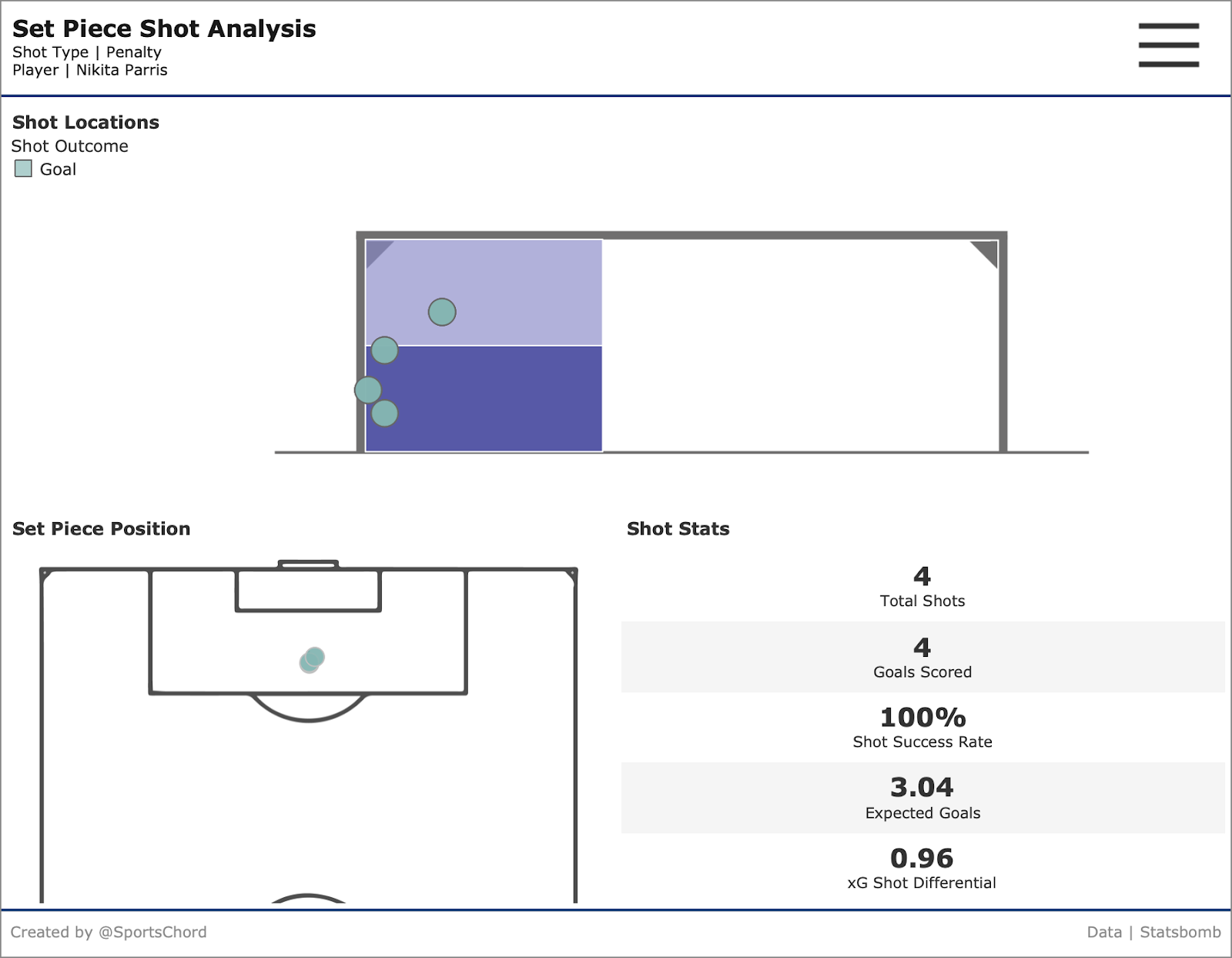
The finished piece of analysis takes the form of a dashboard, in which the user can filter to see the shot map of a certain player, season, set piece type, outcome and minute of the game. The dashboard itself is made up of a ‘shot map’ which displays the end location of the shot in relation to the goal, the position of the set piece and a table of stats including a shot success rate (goals/shots) and an xG shot differential (goals scored — expected goals).
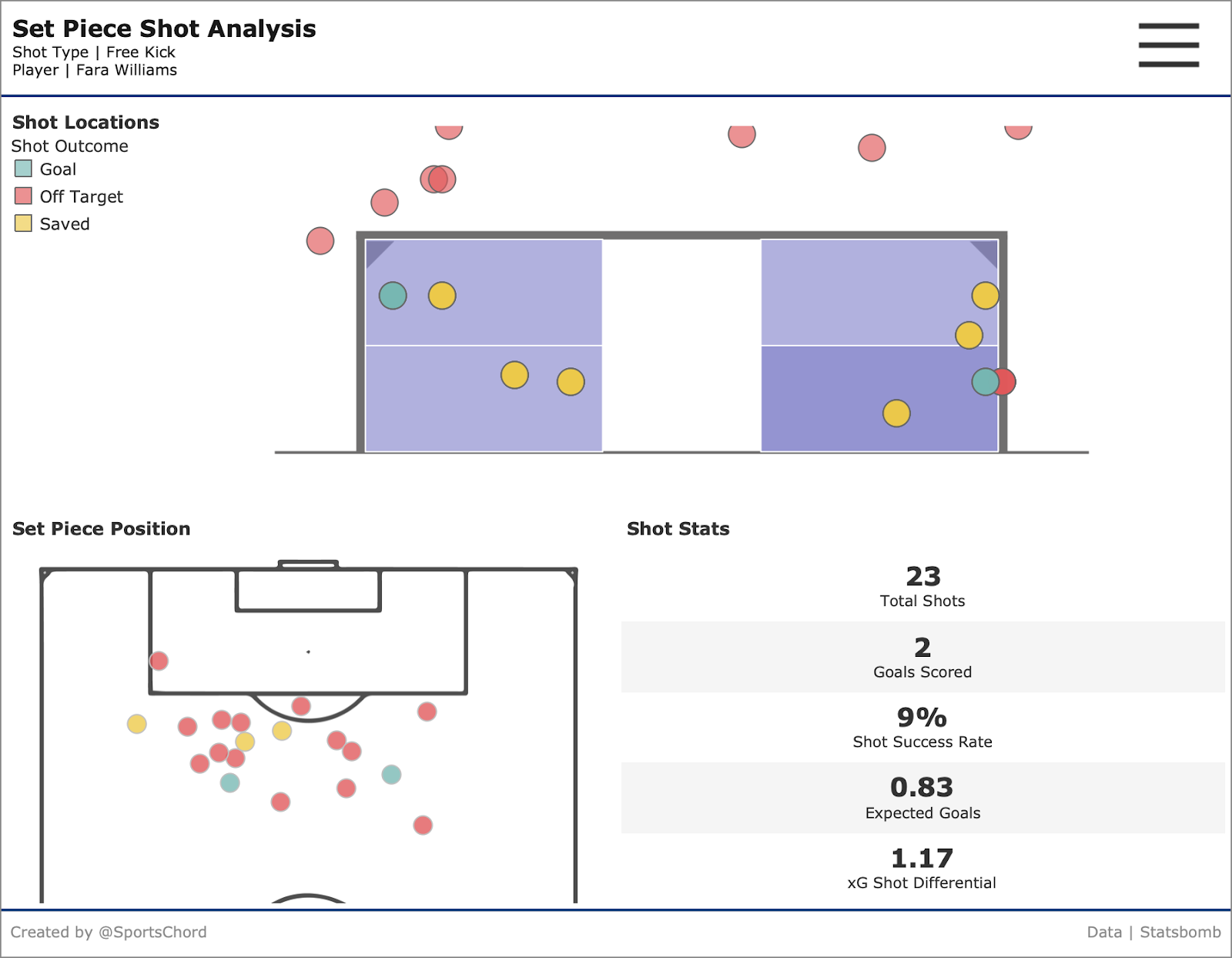
There is a risk when visualising football data that you display everything and therefore communicate nothing. The state of data visualization in football is improving, though if you were to browse twitter feeds and online forums, there continues to be a tendency to crowd the visuals by encoding data points using all manners of shape, size and colour. There is a similar tendency to over-visualise positional, touch and pass maps. Aiming for simplicity and minimal ‘chart junk’ is hugely important in communicating findings and insights effectively.
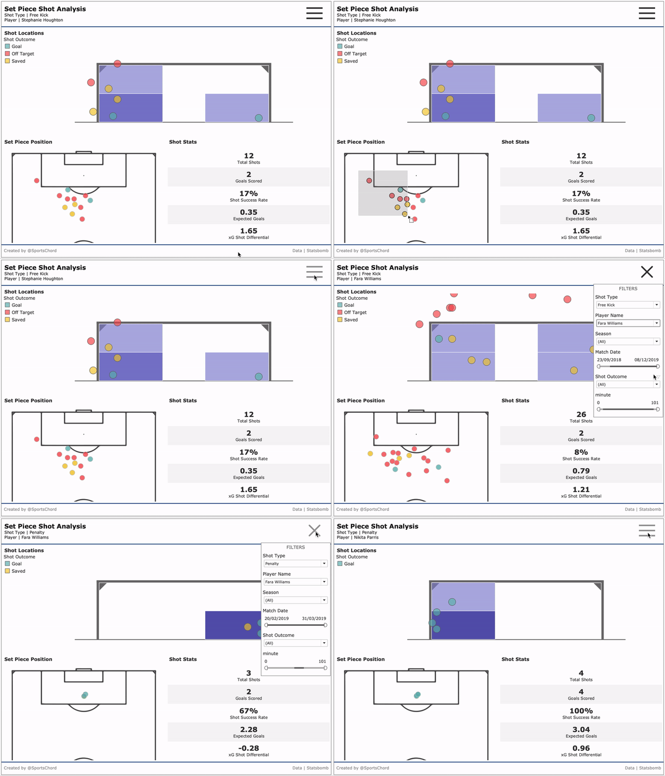
By keeping the dashboard as clean and simple to use as possible, the reader can focus on identifying the patterns that the shots display. There is a Red/Amber/Green (RAG) colour scheme for Goals, Saved & Off Target shots that applies to both the set piece location and shot end location, creating a visual link between the two. Layered behind the shot end location, a heat map calculates whether the shot end falls in the right/mid/left of the goal and the upper/lower half of the goal to help the user identify clusters of shots.
This first example looks at Free Kick efforts on goal by England International Steph Houghton. It quickly becomes clear that she has a preference for shooting towards the left side of the goal, although her two goals from free kicks are split into near identical positions in the bottom right and bottom left side of the goal. From the set piece Position, we can also deduce that Houghton is more likely to take Free Kicks positioned to the left of centre. Given that she is left footed, her shot style is likely to be in-swinging efforts from left of centre to left side of the goal.
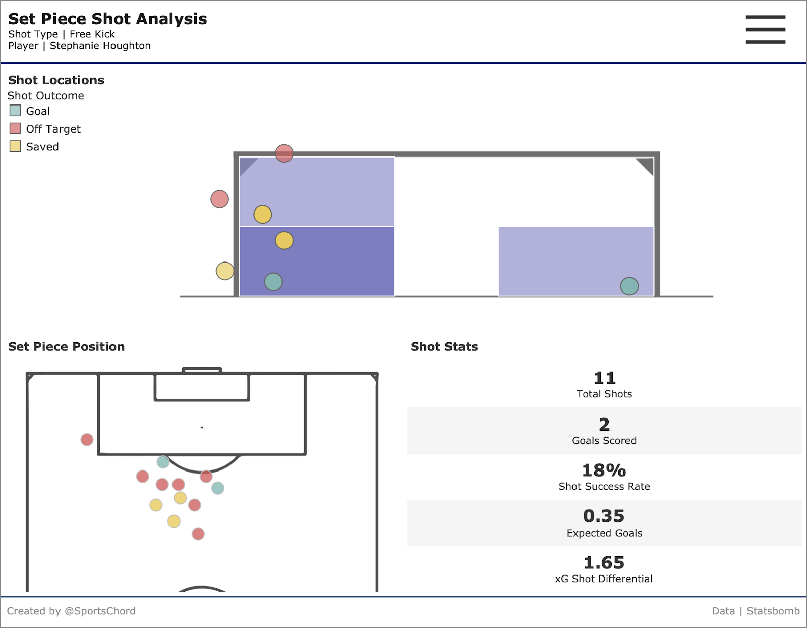
All of the above could be deduced by an attentive scout that was tasked with understanding Houghton’s shooting technique and watching the videos of the goals, but using data visualization allows for the quicker visual assessment of all of Houghton’s efforts. It also offers the possibility to understand the set piece patterns of a far wider range of players at the click of a button.
Let’s now switch attention to Penalties. Unlike Free Kicks, these are from a fixed position and a 1-on-1 situation. There is no wall to worry about and there is just 12 yards between the ball and the goal line. The expectation is, therefore, that the player will score and it is a surprise when a goalkeeper makes a save or the player misses. However, players do still miss and goalkeepers do make saves. StatsBomb’s xG of 0.76 infers that the likelihood of a player not scoring is around once every 4 penalties.
Using data, we can advise goalkeepers on different players’ penalty habits. Below is the shot map of another England International, Nikita Parris. She took and scored 4 penalties in the 2018/19 season, all of which went towards the far left of the goal at a mid-level height. This isn’t absolute proof that her next penalty will fall in the same location, but it gives the opposing keeper an idea of her preference. This information could be used by the keeper to dive in a particular direction with more conviction, preventing a goal. Parris may well place her next penalty to the right, but knowledge of this tendency could give the keeper a better chance of making a save should she continue her recent form.
Using the WSL data provided us with just 2 seasons worth of data, but what if we had more shots and penalties at our disposal. StatsBomb have released every single one of Lionel Messi’s La Liga games over the course of the last 6 months, so let’s now take a look at Messi’s penalties. In these matches, Messi has taken 64 penalties and scored 52 of them, at a success rate of 81%. This makes him a decent, but not an exceptional penalty taker (Eden Hazard & Cristiano Ronaldo are both in the 90%s).
This is where interactive visual analysis unpicks a trend that isn’t visible on a single view. Since the start of the 2015/16 season, Messi’s success rate has slipped to below the 76% (0.76 xG) rate that is considered by StatsBomb’s model as the average chance of scoring a penalty.
Adjusting the filter between the 0–45 minutes and 45–90+ minutes unveils another interesting discovery. In the first half, 100% of Messi’s penalties fall in the lower half of the goal and his success rate drops to just 63%. In the second half, his success rate increases to 69% and 9 out of 14 shots are in or above the upper half of the goal (including 1 over the bar). Just under half (42%) are aimed into the top right hand corner of the goal. This could be due to Messi feeling more comfortable and attuned to the game by the time the second half comes round, giving him the confidence to aim his penalties in the upper half of the goal (arguably a more risky endeavour given the possibility of it going over the bar).

Similarly to the Nikita Parris and Steph Houghton examples, this is not a guaranteed prediction of where Messi’s next penalty will go, but the data enables a discussion with the defending goalkeeper around where to place themselves and which direction to dive depending on the context and timing of the penalty.
Indeed, the increasing use of data to advise defending or attacking teams poses an interesting psychological discussion. Would a goalkeeper truly trust historic data when faced with defending a decisive spot kick in the final minute of a game, or would they revert to their instinct? Will attackers begin to adjust their style in the knowledge that the goalkeepers might know their striking patterns? Perhaps more players will follow the successful technique that Eden Hazard & Jorginho have both showcased in which they lift their head to identify which way the keeper is diving just before striking the ball.
Conclusion
This analysis set out to answer this question using StatsBomb data: ‘Can you visually detect patterns in Player’s set piece efforts on goal?’. I believe it is reasonable to conclude that, using effective data visualizations and through the case studies selected, it is indeed possible to use visual pattern detection to observe set piece trends and thus advise goalkeepers on positioning and dive direction depending on the set piece taker.
The key limitation to this analysis was the amount of data collected. I quickly found with the WSL data that only 3 or 4 players had enough data collected over 1.5 seasons to make reasonable conclusions around whether they had a favoured position to aim at in the goal. Fortunately, this study was based on freely available data and companies such as StatsBomb track set piece information across all major leagues, meaning that clubs paying for this data will be able to analyse using a more complete sample.
On the other hand, analysing Messi’s penalties over a period of 15 years made it difficult to produce effective conclusions until the data was filtered down to the past 4–5 seasons. Arguably, by applying this filter we are making the analysis more relevant anyway, as today’s Messi is very much a different player to the Messi of the early to mid 2000s.
To take this analysis further, it would be interesting to understand set pieces taken in different contexts. Are the team in a losing or winning position when the attacking set piece is awarded? Are players likely to aim for different areas of the goal depending on the position/height of the goalkeeper? Is a penalty taken in front of the opposing team’s fans more or less likely to be scored? These are questions for a further study, but questions that could be answered using visual analysis, StatsBomb Data and a combination of R and/or Tableau.
This analysis was carried out in January 2020 by James Smith using publicly available StatsBomb data, R & Tableau. An interactive version is available to explore on Tableau Public. If you’re interested in learning more about football analytics or the Football Tableau User Group, feel free to reach out to James on Twitter (@sportschord) or by email (sportschord@gmail.com).

1 comentario
Thanks for making these data analysis available. I seek permission to use these “Set Piece Shot Analyses” graphics as a data analysis activity. Is there a possibility to purchase some other sport analysis graphics for grades 7 to 10 students.